Exploring the data - Graphs
 Image credit: https://hackersbyrez0.com/
While it may lack the allure of machine learning models that predict, classify, or “talk,” data exploration is a crucial step that rewards the time you invest in it. By analyzing your data using graphical and mathematical techniques, you can significantly enhance feature engineering, model selection, and model tuning.
This blog focuses on practical applications of data exploration in security, providing code examples and additional resources. We’ll review some valuable visualization techniques with corresponding code and discuss their relevance from a cybersecurity perspective. As always, the code featured in this blog is available in the repository blog_eda_1.
1,000 ft view
What?
Exploratory Data Analysis (EDA) is a foundational statistical approach to understanding data. I particularly like NIST’s definition, which describes EDA as a “philosophy” of treating data as an unknown entity and uncovering the story it tells. The primary objectives of EDA include testing assumptions, identifying outliers, pinpointing key features, selecting appropriate models, and fine-tuning model parameters.
Why?
While creating graphs and gathering statistics about your data might not seem exciting, it plays a critical role in the success of machine learning projects. In my experience, skipping straight to feature extraction or modeling often led to disappointing results. Without a deep understanding of the data’s structure, you cannot effectively engineer or select meaningful features. Furthermore, choosing models arbitrarily wastes both time and computational resources.
How?
To fully explore this topic, we will break it into multiple posts. This will allow us to delve into the process of creating visualizations, generating statistics, and discovering innovative ways to analyze data using AI libraries—one step at a time.
- Exploratory Data Analysis
    - Graphical techniques (part 1 - we are here)
        - Histograms
        - Scatter
        - Box
        - Autocorrelation
    - Statistical techniques (part 2)
        - Location
        - Scale
        - Skewness
        - Randomness
        - Distribution measures
        - Outliers
    - Automation (part 3)
        - EDA Python libraries
        - Pandas AI
Problem statement
In this part of the blog series, we’ll tackle a specific challenge faced by security data scientists: detecting bot behavior using network packet captures. Our goal is to develop a classification model capable of predicting whether a packet or stream of network traffic is benign or malicious.
To achieve this, we’ll use labeled datasets containing both benign and malicious packet captures. By analyzing the known behaviors of these packets, we aim to train a model that can accurately classify the behavior of any new packet capture. For the malicious dataset, we’ll draw from one of my personal favorites: the Mirai botnet traffic capture.
Exploratory Data Analysis (EDA)
EDA is a methodology for approaching an unfamiliar dataset with the goal of uncovering the story it tells. This process typically involves:
- Graphical Techniques: Creating graphs involves using statistical tools to provide a visual representation of the data, while offering valuable insights. For example, do we have any unusual outliers in our packet captures? Is the user behavior we suspect actually unusual? Is a decision tree a good choice for classifying malware? Using statistical tools to create visual representations of data, which provide valuable insights. For example:
- Are there unusual outliers in our packet captures?
- Is the user behavior we suspect truly anomalous?
- Would a decision tree be suitable for classifying malware?
- Statistical Analysis: Applying quantitative methods to summarize data. While less intuitive than visualizations, statistical techniques help test assumptions and reveal meaningful numerical patterns.
EDA and Graphical Techniques
Graphs are often the starting point for EDA. While there is no strict sequence for analysis—you might prefer statistics for their straightforward implementation—I typically begin with graphical techniques because I am a visual learner. Visualizations help me better understand the statistical characteristics of the data.
Challenges with graphical techniques
Graphical techniques rely on numerical data, but cybersecurity datasets are often not conveniently formatted this way. This creates a chicken-and-egg dilemma: numerical feature extraction is part of feature engineering, but EDA is meant to guide feature engineering. In our examples, we will keep feature engineering minimal and work with data typically encountered in security contexts. I will also share strategies I have developed to tackle these challenges.
Histograms
A histogram is a bar graph where each bar (or bin) represents a category, such as packet length, and the bar’s height indicates the frequency, like the number of packets of a given length in a packet capture. I often start with histograms because they are simple to create and offer an excellent overview of data distribution and behavioral patterns.
Histograms are particularly useful for tasks that involve “bean counting.” However, their accuracy depends on the number and size of bins. While more bins provide finer granularity, excessive granularity can obscure meaningful trends.
Let’s explore this with the Mirai packet capture. Using this dataset, we’ll build histograms to uncover its story. We begin by loading the data into a DataFrame and then leverage a simple DataFrame function to create the histogram:
import pandas as pd

mirai = pd.read_csv("../data/blog_eda/mirai.csv")
mirai.hist(column="Length", bins=range(50,100))
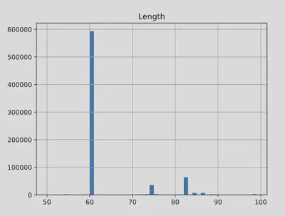
Here, I used the only numeric data available for plotting the Length column. By specifying a range, I clarified the trend and allowed the plotting function to automatically determine the number of bins. Alternatively, you can control the granularity by specifying the number of bins manually using the bins parameter.
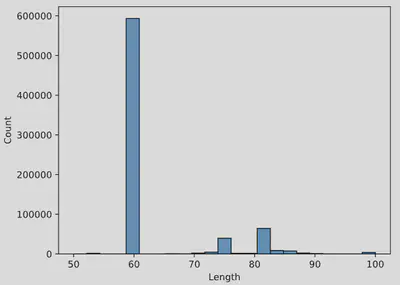
For more advanced visualizations, consider exploring seaborn, a powerful Python library for creating refined and aesthetically pleasing graphs:
import seaborn as sns

sns.histplot(data=mirai, x="Length", binrange=(50,100))
Scatter plots
A scatter plot is a common tool for visualizing relationships between two dimensions of data, such as packet size on the x-axis and interarrival rate on the y-axis. This type of plot can highlight patterns or correlations between variables, such as whether they increase or decrease together or show little to no relationship. Scatter plots are especially useful for classification tasks. For instance, we can use different colors to distinguish between malicious and benign packets, and a dividing line can aid in designing an effective classification model. The choice of features to plot is critical for building a robust model.
Let’s examine an example using scatter plots from the Mirai dataset. To start, we need to create an additional feature: the packet interarrival time, which represents the time interval between consecutive packet arrivals. We calculate this using the numpy function diff, which subtracts consecutive timestamp values. Since np.diff reduces the array length by one, we use the numpy function append to add a zero at the end of the interarrival_times array, ensuring it matches the length of the original timestamps array.
Finally, we add this new column, Interarrivals, to our Pandas DataFrame containing the Mirai packet capture data. To ensure compatibility with future operations, we convert the column’s data type to float.
import numpy as np

interarrival_times = np.diff(timestamps) / 1000
interarrival_times = np.append(interarrival_times, [0])
mirai["Interarrivals"] = interarrival_times.astype(float)
Then we can create a scatter plot to visualize the relationship between packet interarrivals and length. Note that we use a subset of the data, i.e., the first 10,000 rows, since scatterplots are resource intensive to make:
mirai_subset = mirai.head(10000)
mirai_subset.plot.scatter(x="Length", y="Interarrivals")
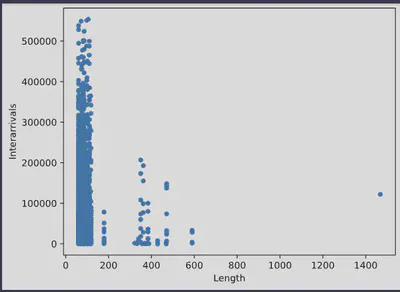
This graph already provides insights into the relationship between interarrival times and packet lengths. Larger packets tend to have shorter interarrival times and are less frequent. Additionally, we can observe some outliers at packet lengths of 600 and 1,450 bytes.
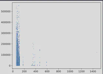
Below is the same plot generated using seaborn. While the overall appearance is similar, the visualization is slightly sharper and more refined:
import matplotlib.pyplot as plt
import seaborn as sns

plt.plot( 'Length', 'Interarrivals', "", data=mirai_subset, linestyle='', marker='o', markersize=0.7)
Box plots
Box plots are an efficient tool for visualizing statistical data. They showcase the variability and range of values, making it simple to compare different groups within a dataset. The example below highlights the usefulness of a box plot:
import seaborn as sns

mirai_subset = mirai.sample(n=100, random_state=1)
sns.boxplot( x=mirai_subset["Length"], y=mirai_subset["Interarrivals"])
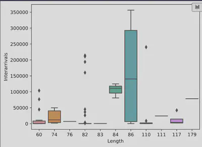
We plotted the relationship between packet length and interarrival times using a random sample of 100 packets from the Mirai packet capture. We used the sample function, which is another powerful feature of Pandas, especially helpful when working with large datasets. As shown, there is no strong correlation between packet lengths under 86 bytes, but a statistical relationship is observed between longer packet lengths and interarrival times.
Qualitative data
Much of the data in cybersecurity is qualitative, or “categorical,” meaning it consists of information that is not easily quantified, such as packet details, IP addresses, and TCP flag types. In this section, we’ll explore some useful EDA graphs for visualizing this type of data.
Bar plots
A simple and effective way to visualize categorical data is by creating bar plots, which count the occurrences of different values in the dataset. For example, we might want to count how many times a particular source IP appears in a random sample of the dataset:
import numpy as np
import matplotlib.pyplot as plt

mirai_source_counts = mirai["Source"].value_counts()
# Get the top 10 source IPs by highest count
top_10_source_ips = mirai_source_counts.nlargest(10)
# Create a bar plot, use barh for horizontal bars
top_10_source_ips.plot(kind="barh", color="purple")

# Add labels and title
plt.xlabel("Source IP")
plt.ylabel("Count")
plt.title("Top 10 Source IP Counts")

# Show the plot
plt.show()
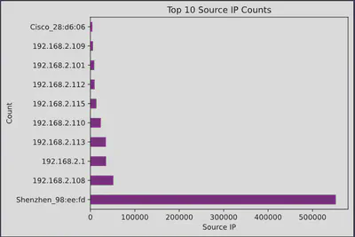
This code snippet uses the Pandas and Matplotlib libraries to visualize the top 10 source IP addresses from a dataset, specifically focusing on their occurrence counts. More specifically:
mirai_source_counts = mirai["Source"].value_counts()
This line counts the occurrences of each unique source IP address in the Source column of the mirai DataFrame. The result is a Series where the index is the source IPs and the values are their respective counts.
top_10_source_ips = mirai_source_counts.nlargest(10)
This line retrieves the top 10 source IP addresses with the highest counts from the previously created Series. The nlargest(10) function returns a new Series containing the 10 largest values.
Then we visualize these IPs with a horizontal bar plot:
top_10_source_ips.plot(kind="barh", color="purple")
This is a great method for identifying the most frequent IPs, ports, and other elements. From these IPs, we might deduce that Shenzhen_98:ee:fd belongs to a Command and Control (C2) server. Notice the powerful Pandas function, value_counts, which performs a group-by operation on our DataFrame, grouping the data by source IPs and providing the corresponding counts.
Wordclouds
Logs and payloads are often text-heavy, making word clouds an effective tool for exploration.
In the example below, I’ve concatenated a sample of the information sections from the Mirai packet captures and generated a word cloud:
# Libraries
from wordcloud import WordCloud
import matplotlib.pyplot as plt

# Create a list of word
text=mirai_subset["Info"].str.cat(sep=' ')

# Create the wordcloud object
wordcloud = WordCloud(width=800, height=800, background_color='white').generate(text)

# Display the generated image:
plt.figure(figsize=(8, 8), facecolor=None)
plt.imshow(wordcloud)
plt.axis('off')
plt.tight_layout(pad=0)

# Show the plot
plt.show()
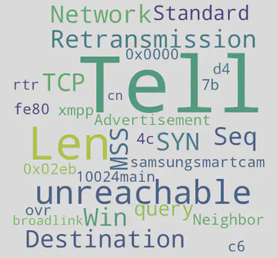
Here, words like samsungsmartcam, rtr, and broadlink suggest that the dataset targets IoT devices. The word Tell likely originates from ARP messages and may be removed with some data cleanup.
Treemaps
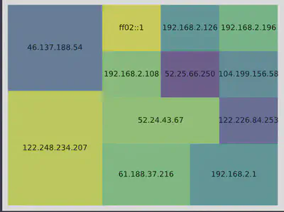
Treemaps are an excellent tool for visualizing categorical data, where the size of each square represents the relative popularity of a category. The treemap algorithm scales the categories proportionally to fill a specified area.
In the example below, we’re plotting a random subset of the data. We exclude the “Broadcast” address because it doesn’t provide meaningful insights and would distort the treemap.
# libraries
import matplotlib.pyplot as plt
import squarify    # pip install squarify (algorithm for treemap)
import pandas as pd

# prep data
# first filter out broadcast destination
mirai_dest = mirai_subset[mirai_subset["Destination"] != "Broadcast"]
# create count and label values
mirai_dest_counts = mirai_dest["Destination"].value_counts()
sizes = mirai_dest_counts.values.tolist()
labels = list(mirai_dest_counts.index.values)

# plot it
squarify.plot(sizes=sizes, label=labels, alpha=.8 )
plt.axis('off')
plt.show()
The cybersecurity perspective for EDA
Let’s recap how Exploratory Data Analysis (EDA) fits into cybersecurity, along with its benefits and limitations:
-
Handling Non-Numerical Data: A significant portion of cybersecurity data, such as logs, payloads, and results from static malware analysis, is textual and difficult to visualize. We need to convert this data into numerical form through feature engineering or employ creative visualization techniques like word clouds and treemaps.
-
Histograms: Histograms provide valuable insights into cybersecurity data, such as the distribution of packet lengths or interarrival times. Extreme values may indicate outliers, which can lead to the discovery of unusual or malicious behavior.
-
Bar Plots: Bar plots are useful for displaying top-N values, helping prioritize incident response and analysis. They allow us to determine which packet captures to analyze first or which servers to patch, making analysis and response more efficient and effective.
-
Scatter and Box Plots: While these plots reveal relationships between variables, it’s crucial to remember that “correlation does not imply causation.” Identifying causes can be complex and requires a combination of visual, statistical, and subject-matter expertise. In the next blog, we will explore this important nuance of attribution. Additionally, scatter plots can help separate data into categories, such as distinguishing between malware campaigns or classifying data as malicious or benign, which is valuable for cybersecurity analysis.
Recap
We have reviewed various visual methods for exploring both quantitative and qualitative data. The possibilities for plotting your data are endless. It’s worth investing time in exploring different visualizations, as the benefits will become evident when you perform feature selection and modeling.
– Xenia
Going Even Deeper
Code examples for this blog can be found in blog_eda_1.
Python graphing
- Python graph gallery: great collection of graphs and coding examples using matplotlib, seaborn, and plotly.
- Plotly graphs: another useful collection with examples.
- Seaborn gallery: comprehensive collection of Seaborn graphs with examples.
- Matplotlib
EDA
- NIST EDA Handbook: a comprehensive website on EDA techniques.
- EDA with Python Pandas